OUR THIRD EXERCISE — COLOUR VARIATIONS |
|
Now this is where things can get really interesting. And yes, folks, we're still working with good old "50% Nearest Neighbor" which we made at the start of our Second Exercise! A gentle reminder, just for old time's sake . . . |
|
|
|
|
So far we've looked at variations within the original colour scheme (more or less) of the tile. In this exercise we're going to look at changing the colour scheme. OK, we know we could have started from scratch with another Preset from our EG-012 series to produce a brand-new, different-coloured tile, but we like to experiment; and besides, we think this Tile still has a good few surprises tucked up its sleeve. |
|
What we're going to do in this Exercise is to re-visit some of PhotoShop's functions we tried out in our Second Exercise. You should already be familiar with them so we can therefore forget about the basics, although cross-references are provided just in case you need a quick refresher. Others we mentioned only briefly but ignored as they're "colour only"; we'll work from the ground floor up on these. |
 |
Variation 1 - Opacity & Backgrounds |
|
We covered this in Variation 2 of our Second Exercise - 'Opacity & Background Colour' - but only in respect of our image's existing colour palette. In Method 1 we looked at image opacity, then, working with our image at 50% opacity, played with Transparency Index Colour in Method 2 and considered the alternative of background layers (with a peek at the basics of PhotoShop's Layers) in Method 3. If you want to go back over any of that material again . . . |
|
|
|
|
If you've been away, welcome back! Here we're going to concentrate solely on background layers, as they're so much more flexible than Transparency Index Colours (which, if you remember, we rarely use). You already know how to add a new layer to your image and flood-fill it with a chosen colour, so there's nothing we can usefully add to matters of technique. |
|
OK, then, let's see what backgrounds can really do and have a look at some results. We've set our graphic's opacity to 50%, as in our Second Exercise, and used colours which are not related to its palette (i.e. not "self colours"). We're showing a significantly larger number of examples than usual (28 in total! ) but this is quite deliberate and we make no apologies for it. At the risk of overwhelming you with the sheer quantity, our aim is - as always - to give you a fairly comprehensive idea of what can be accomplished . . . |
|
Background |

RGB 229:124:31
|
gives |
 |
|
|
|
|
Background |

RGB 153:51:18
|
gives |
 |
|
|
|
|
Background |

RGB 255:102:0
|
gives |
 |
|
|
|
|
Background |

RGB 213:147:20
|
gives |
 |
|
|
|
|
Background |

RGB 247:196:39
|
gives |
 |
|
|
|
|
Background |

RGB 254:232:164
|
gives |
 |
|
|
|
|
Background |

RGB 255:255:38
|
gives |
 |
|
|
|
|
Background |

RGB 182:217:41
|
gives |
 |
|
|
|
|
Background |

RGB 122:118:4
|
gives |
 |
|
|
|
|
Background |

RGB 138:198:67
|
gives |
 |
|
|
|
|
Background |

RGB 0:255:0
|
gives |
 |
|
|
|
|
Background |

RGB 0:160:0
|
gives |
 |
|
|
|
|
Background |

RGB 0:100:0
|
gives |
 |
|
|
|
|
Background |

RGB 0:50:0
|
gives |
 |
|
|
|
|
Background |

RGB 22:118:94
|
gives |
 |
|
|
|
|
Background |

RGB 20:222:173
|
gives |
 |
|
|
|
|
Background |

RGB 0:103:128
|
gives |
 |
|
|
|
|
Background |

RGB 66:196:227
|
gives |
 |
|
|
|
|
Background |

RGB 95:95:255
|
gives |
 |
|
|
|
|
Background |

RGB 0:0:255
|
gives |
 |
|
|
|
|
Background |

RGB 0:0:90
|
gives |
 |
|
|
|
|
Background |

RGB 63:0:117
|
gives |
 |
|
|
|
|
Background |

RGB 120:0:221
|
gives |
 |
|
|
|
|
Background |

RGB 153:51:204
|
gives |
 |
|
|
|
|
Background |

RGB 253:129:252
|
gives |
 |
|
|
|
|
Background |

RGB 175:0:140
|
gives |
 |
|
|
|
|
Background |

RGB 190:0:99
|
gives |
 |
|
|
|
|
Background |

RGB 255:165:165
|
gives |
 |
|
|
|
|
. . . and finally, the image colour we used with our SBP Preset EG-012f when
making our original Tile . . . |
|
Background |

RGB 255:38:38
|
gives |
 |
|
|
|
|
|
Finished at last! It would be fair to say that there are some very attractive and subtle results here, particularly from the lighter yellows through the greens to the light blues. We'll most certainly use some of them when building Web Sites in the future. It is also evident that the closer the background is to the original graphic's overall colour, the smaller the change and the less the chance of subtlety. |
|
Remember that these results can show you only some of this function's potential. We can't hope to show you it's full scope, which is considerable, so strongly recommend that you try it for yourself; it could well pay real dividends. Do bear in mind, though, that this function's potential is not limitless. Your graphic's colour palette will always have an influence on the result, regardless of the background you use, with the degree of influence directly proportional to the graphic's level of opacity. |
|
Variation 2 - Tonal Adjustment |
|
This is where we go back to the 'Adjust' function that we examined in our Second Exercise. This time we're going to look at the options affecting the graphic's colour palette, of which there are four . . . |
|
|
|
Color Balance ... |
Invert |
Variations ... |
Hue /Saturation ... |
|
|
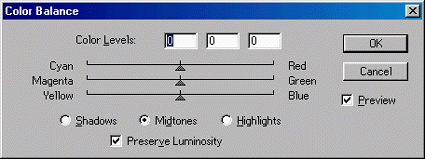
COLOR BALANCE |
|
This function is wholly concerned with colour changes, so we've not looked at it before. Select 'Image' + 'Adjust' then click on 'Color Balance ...', and the 'Color Balance' dialogue box pops up . . . |
|
 |
|
Each of the three sliders has a value range of -100 (left) to +100 (right), mid-point 0, for a pair of named colours. To increase the balance of a named colour in your image, just move the slider toward that colour. The more you move it, the greater the increase. It's as simple as that - or it can be. You can adjust any or all of the sliders in one visit. You can also select your image's 'Shadows', 'Midtones' or 'Highlights' for adjustment by clicking the relevant radio button - again, any or all in one visit. Make sure you've ticked/checked the 'Preview' option if you want to see the result of your changes as you make them. When you're happy with the result, just click 'OK'. |
|
One point is worth making here. If the maximum adjustment to the balance of a particular colour isn't enough, don't give up. Make the maximum adjustment and click 'OK', then select this function again and adjust it some more! You can double, triple, quadruple or more any adjustments you want; just stop when you've had enough! |
|
Here are some step-by-step examples of "progressions", each starting with our old friend "50% Nearest Neighbor" . . . |
|
1. |
Let's adjust Cyan to the maximum, then repeat it two more times, Midtones only . . . |
|
Cyan -100
 |
|
|
|
+ Cyan -100
 |
|
|
|
+ Cyan -100
 |
|
|
|
|
2. |
Now we'll do that again, but this time with the image's Shadows only . . . |
|
Cyan -100
 |
|
|
|
+ Cyan -100
 |
|
|
|
+ Cyan -100
 |
|
|
|
|
3. |
And a third time, with the image's Highlights only . . . |
|
Cyan -100
 |
|
|
|
+ Cyan -100
 |
|
|
|
+ Cyan -100
 |
|
|
|
|
4. |
Finally, to round off this particular approach, we'll combine the three previous series by repeating the "triple maximum Cyan" with all three of the image's elements - Shadows and Midtones and Highlights . . . |
|
Cyan -100
 |
|
|
|
+ Cyan -100
 |
|
|
|
+ Cyan -100
 |
|
|
|
|
|
These four series make for interesting comparisions, if rather lifeless, but at least they give a good indication of what happens when adjusting the different elements of an image. Now let's liven things up a little and look at some more interesting results . . . |
|
5. |
Applying multiple and repeated colour adjustments; random thoughts, really, adjusting Midtones only . . . |
|
Cyan -50
& Green +100
& Yellow -100
 |
|
|
|
+ Yellow -100
 |
|
|
|
+ Red +100
& Magenta -100
 |
|
|
|
+ Blue +100
 |
|
|
|
+ Blue +100
. . . again
 |
|
|
|
+ Blue +100
. . . a third time
 |
|
|
|
+ Cyan -100
& Green +100
& Yellow -100
 |
|
|
|
+ Green +100
 |
|
|
|
+ Cyan -100
& Magenta -100
& Blue +100
 |
|
|
|
+ Yellow -100
 |
|
|
|
|
|
. . . and so it could go on, ad infinitum . . . but we're sure you get the idea by now! What would be interesting is to try subduing some of these results, using the Brightness, Saturation and/or Lightness facilities in other Adjust functions - but we'll leave that to you! |
|
|
This is a very powerful function, as you can use it to shift an image's colour palette of to virtually anything in the spectrum. We use it quite frequently as it can produce some very attractive results (and some real dogs if we're really careless! ). |
|
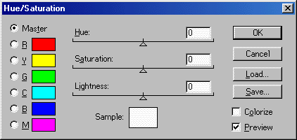
HUE / SATURATION |
|
You should remember this function from our Second Exercise - select 'Image' + 'Adjust' + 'Hue /Saturation ...', and the 'Hue /Saturation' dialogue box pops up . . . |
|
 |
|
We're only going to look at the 'Hue' option here. As with the 'Saturation' and 'Lightness' options, which on their own have no affect on an image's colour palette, this is very simple to use. You just click and drag the slider to give values between -180 and +180. Note that your image always has a start value of zero, and that the extreme values of ±180 give the same result; imagine the slider as moving round a circle. Make sure you've ticked/checked the 'Preview' box if you want to see the effect of your actions as you make them. |
|
The potential of this option is quite wide, as it is capable of shifting the colour palette to pretty well any point in the spectrum. Let's have a quick look at some results across the full adjustment range, where we've kept to the 'Master' option in the dialogue box's top left corner . . . |
|
Level = +30
 |
|
|
|
Level = +60
 |
|
|
|
Level = +90
 |
|
|
|
Level = +120
 |
|
|
|
Level = +150
 |
|
|
|
Level = ±180
 |
|
|
|
Level = -150
 |
|
|
|
Level = -120
 |
|
|
|
Level = -090
 |
|
|
|
Level = -060
 |
|
|
|
Level = -30
 |
|
|
|
|
Given the brightness of our original image, these reults are as expected - they're bright, too, just different colours! They don't really help in our quest for subtleness, do they? However, a very useful feature of this function is that you can use the 'Hue', 'Saturation' and 'Lightness' in combination, so it's very easy to tone down and/or darken any result as you're going along. For example, look at the "+120" result above; a bit lurid, isn't it? But if we set both Saturation and Lightness to -50 in addition to adjusting the Hue, step-by-step we get . . . |
|
Original
 |
Hue = +120
|
Saturation = -50
 |
Lightness = -50
 |
|
|
|
|
|
. . . which is really quite acceptable. Go on, give yourself a treat and try it yourself! |
|
INVERT |
|
Another new function. Select 'Image' + 'Adjust' then click on 'Invert'. There's nothing else to do; no dialogue box, no parameters to set, nothing. The effect is instantaneous . . . |
|
|
|
|
What happened here? We'll let PhotoShop's Help explain . . . |
|
. . . "[this function] creates a negative of an image. You might use this command to make a positive image negative or to make a positive from a scanned negative. When you invert an image, the brightness value of each pixel in the image is converted to the inverse value on the 256-step color-values scale. For example, a pixel in a positive image with a value of 255 is changed to 0, and a pixel with a value of 5 is changed to 250." |
|
|
Er, yes, exactly! |
|
Not really much the wiser? OK, here's another way of looking at it. Each pixel in an image is a certain colour, which can be defined by its unique "RBG code". This is a 3-part numeric code representing the brightness, on a 0-255 scale, for each of the colour's 3 components - Red, Green and Blue. Inverting a colour simply subtracts the value of each of its components from the maximum of 255. Let's use a representative colour from our image as an example . . . |
|
Maximum . . . |
R
255 |
G
255 |
B
255 |
minus |
Original |
254 |
94 |
65 |
= |
 |
|
|
 |
|
|
gives |
Inverse |
1 |
161 |
190 |
= |
 |
|
|
This function simply inverts every pixel in an image, the effect of which here is most pleasing and quite subtle. Certainly useable. |
|
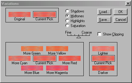
VARIATIONS |
|
Another familiar face - or it should be. You might want to pop back quickly to our Second Exercise to go over the salient points again (when you've finished, click on your browser's 'Back' button to return here) . . . |
|
|
|
|
Here's a reminder of the 'Variations' dialogue box - select 'Image' + 'Adjust' then click on 'Variations ...' and up it pops . . . |
|
 |
|
We're concerned only with the first three options - 'Shadows', 'Midtones and 'Highlights' (top centre) - having dealt with the 'Saturation' option in our Second Exercise. You'll remember that this means the "Big Box" (bottom left) will always display the colour adjustments as shown in the screen-shot above. The use of this function for adjusting an image's colour pretty well speaks for itself. All you do is select the option, set the 'Fine'/'Coarse' slider as required, then click away on the relevant 'More [colour]' image versions in the "Big Box" until its 'Current Pick' displays the effect you want - or until you give up in disgust! |
|
As we said in our Second Exercise, this function is just a different way of achieving the same ends as other 'Adjust' functions. In this case they are 'Color Balance' and 'Hue' (in 'Hue /Saturation') which we've just looked at above, so there's no point in showing any examples - they'd only repeat what we've already shown you. |
|
|