OUR THIRD EXERCISE — COLOUR VARIATIONS |
|
. . . continued . . . |
 |
Variation 3 - Colour Replacement |
|
And now for something really different! In this Variation we are going to leave PhotoShop and play around with one of Corel Photo-Paint's functions. Most if not all of the PhotoShop functions we've looked at are also available in Photo-Paint in one form or another, so the choice of which package to use is usually down to personal preference. However, Photo-Paint has one extremely useful function that PhotoShop sadly lacks - or do later versions than ours (5.0LE) have it? This is called Replace Colors (note the correct spelling! ). |
|
Colour Replacement works by the simple expedient of replacing a selected colour in your image with another colour (which can be anything you like) and matching to it, in terms of tone, all the other colours in your image. This implies that you can do pretty much anything you like with your image in terms of colour, virtually without restriction. And you know what? You can; the world is your oyster! |
|
"Yeah, yeah," we hear you say, "enough of the advertising, show me! " To hear is to obey, so here goes . . . |
|
 |
Open your graphic in Photo-Paint. Take note that Photo-Paint can't handle PhotoShop's PSD image files, so you'll have to use a GIF version - you did save our old friend "50% Nearest Neighbor" as a GIF, didn't you? If you say "oops", you'd better do it now! |
|
|
Not only can't Photo-Paint handle PhotoShop's PSD image files, its 'Replace Color' function doesn't work on GIFs. What you have to do is use Photo-Paint to make a copy of the GIF you've just opened. Just click on the 'Image' menu's 'Duplicate' option; this will create a copy of your graphic as a Photo-Shop CPT image file. That's what you do your colour replacement work on, and you can save the result as a GIF when you've finished. Life does seem un-necessarily complicated sometimes, doesn't it? |
|
|
Using the CPT version of your graphic, select the 'Image' menu's 'Adjust' option (sound familiar?) then click on 'Replace Colors ...' in the drop-down list, and the 'Replace Colors' dialogue box pops up . . . |
|
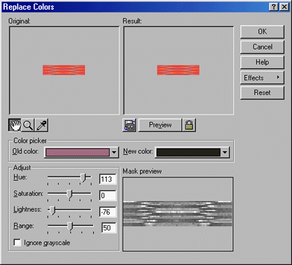
Note - This screen-shot is only 85% of full size
|
|
|
The most important elements here are the 'Original', 'Result' and 'Color Picker' boxes, together with the 'Adjust' box's 'Range' slider. |
|
|
The 'Original' box displays your original image before any changes (impeccably logical, don't you think?). Note the three buttons below the box . . . |
|
|
|
You can enlarge or reduce the view of the image at any time; just click on the middle  button. If you want to enlarge the view, you then left-click anywhere in the box (the cursor will now look like the button's icon), and keep clicking until the image is the size you want. If you want to reduce the view, right-click instead. button. If you want to enlarge the view, you then left-click anywhere in the box (the cursor will now look like the button's icon), and keep clicking until the image is the size you want. If you want to reduce the view, right-click instead. |
|
|
If the image is larger than the box and you want to look at a part of which is hidden, you can move the image within the box. Just click on the right-hand  button, place the cursor anywhere in the box (it will now look like the button's icon), then click and drag the image until you can see the part you want. button, place the cursor anywhere in the box (it will now look like the button's icon), then click and drag the image until you can see the part you want. |
|
|
The left-hand  button is used to select the colour on which you're going to base your colour replacement. We'll deal with that in just a moment. button is used to select the colour on which you're going to base your colour replacement. We'll deal with that in just a moment. |
|
|
|
The 'Color Picker' box displays shows two colour swatches, 'Old Color' and 'New Color', the meanings of which are self-explanatory. This is where you specify the colour on which you want to base your colour replacement, and the replacement colour itself. |
|
|
|
'Old Color' always shows the colour of your image's top left-hand pixel - the default colour - when the dialogue box first opens. |
|
|
'New Color' also has a default when the dialogue box first opens - the colour you selected as 'New Colour' the last time you used this function. |
|
|
|
The 'Result' box displays your image after you have set a 'New Color' in the 'Color Picker' box (or made other changes, which we'll come onto later), but note the three buttons below the box . . . |
|
|
|
If you want to display the result as soon as you have made a change (e.g. set a 'New Color'), click on the right-hand  button; its appearance will change to button; its appearance will change to  . Use of this button locks/unlocks what we call "immediate preview mode"; you can use it at any time. . Use of this button locks/unlocks what we call "immediate preview mode"; you can use it at any time. |
|
|
If "immediate preview mode" is not set, you can display the result of a change simply by clicking on the middle 'Preview' button. |
|
|
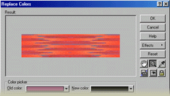
The preview 'Result' image will be shown at the same magnification or reduction as you set for the 'Original' image. If you can't see enough of the preview 'Result' image, you can expand the size of the 'Result' box by clicking on the left-hand  toggle button. This hides the 'Original' box with the 'Result' box taking over the free space; the dialogue box's top half will look like this half-size screen-shot . . . toggle button. This hides the 'Original' box with the 'Result' box taking over the free space; the dialogue box's top half will look like this half-size screen-shot . . . |
|
 |
|
|
Note that the 'Original' and 'Result' boxes' buttons have been moved to the right-hand side of the dialogue box. You can revert to the "two box" view at any time, just by clicking on the toggle button again. |
|
|
|
The 'Range' control at the bottom of the 'Adjust' box plays a significant rôle in the way your colour replacement is applied. It specifies the range of colours in your image to be replaced, with settings between 1 and 100. Although a setting of 1 will replace just 1 colour (surprise! ), we're not sure as to what the scale represents. It doesn't seem to be the number of colours, and it isn't a percentage of the image's colours either, so far as we can tell; sadly, Photo-Paint's Help isn't very helpful on this point. Anyway, you just click and drag the slider to the setting you want. We normally prefer the effect of the "full monty" (i.e. 100), but you can judge for yourself what may be best as we've included a series of examples using a variety of settings. |
|
|
|
Right, that's the ground-work done. Now let's see how we actually use this function. In truth it's a very simple two-step process . . . |
|
1. |
First, select the colour you want to replace. You could use the default 'Old Color', but if you want something else there are two ways of doing it . . . |
|
|
|
Pick a colour from the image itself, in the 'Original' box. The best approach here, we've found, is to enlarge the image enough to distinguish its individual pixels, then locate a pixel of the colour you want; you may have to move the image around in the box to do this. Having found a suitable pixel, click on the 'Original' box's right-hand button, then click on the pixel itself (the cursor will look like the button's "eyedropper" icon while it is over the 'Original' box). As soon as you do that, 'Old Color' will show the selected pixel's colour. |
|
|
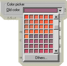
Click on the  "drop-down" icon immediately to the right of the 'Old Color' swatch. A chart of all the colours in your image will appear . . . "drop-down" icon immediately to the right of the 'Old Color' swatch. A chart of all the colours in your image will appear . . . |
|
 |
|
|
All you have to do is click on the colour you want; the 'Old Color' swatch will change accordingly. |
|
|
|
It's a moot point as to which of the image's colours to choose. Our own rule of thumb is to select the colour which we feel captures the overall "mood" of an image. In this particular case we would probably go for . . . |
|
 > > > > > >
|
|
|
. . . or something close to it. A sort of guide as to the likely outcome of replacing a given colour is available in the 'Mask Preview' box, in the lower right-hand quarter of the dialogue box. This shows your image in greyscale; to quote Photo-Paint's Help pages . . . it "displays the areas of your image that are affected by the color replacement. White areas are fully affected, grey areas are partially affected, - the lighter the grey, the greater the impact (our addition) - and black areas are unaffected. " The Mask is a little different for each colour. In the end, your choice of colour is largely a matter of trial and error - and of personal preference, probably. |
|
2. |
Second, select the colour you want to use as the basis for replacement. Refering to the Mask Preview, white areas of your image will be fully replaced by this colour, and grey areas will be partially replaced by it (i.e. blended with the existing colour) to a greater or lesser extent. To set your chosen color . . . |
|
|
|
Click on the "drop-down" icon immediately to the right of the 'New Color' swatch. A chart of all the colours in your image will appear, the same as in the screen-shot shown above for the 'Old Colour'. |
|
|
You can choose one of these "self colours" if you wish - it might produce a pleasing result - but doing so perhaps defeats the purpose of "colour replacement". However, if that's what you really want, just click on your chosen colour; the 'New Color' swatch will change accordingly. |
|
|
The more usual choice of colour will be something rather different to anything found in your image, so click on the 'Others ...' button at the foot of the colour chart and the 'Select Color' dialogue box opens . . . |
|
|
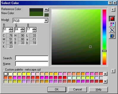
Note - This screen-shot is only 85% of full size
|
|
|
|
Selecting a colour in this dialogue box can be pretty much the same as with PhotoShop's 'Color Picker' dialogue box. However, there are some very useful additional facilities here which PhotoShop doesn't have, and you may well want to make use of them at some time . . . |
|
|
|
The 4 buttons on the upper right-hand side of the dialogue box give different options for colour selection. We cover them only briefly here (but do try them at home! ) as there is quite a lot to each of them, and this really isn't the place to go into detail . . . |
|
|
 |
|
The top button - the 'Color Model' option - is the simplest and more or less identical to PhotoShop's 'Color Picker', as shown in the screen-shot above. The only difference is that you have a choice of colour models - RGB, CMYK, Greyscale, etc. - whereas PhotoShop has only one, RGB. Ignoring this choice (we usually choose RGB, but go ahead and try the others for yourself), you "coarse select" a colour using the slider on the vertical "rainbow" immediately to the left of the buttons, then refine your choice by clicking and dragging the small square locator in the large "shade" box. |
|
|
 |
|
The second button is the 'Palettes' option. It allows you to select from a number of different colour-matching palettes, which "you may want to use . . . if you are working with spot or process color systems " so that "you can be reasonably certain of how the colours will look when printed " (to quote Photo-Paint's Help). Now you know! |
|
|
 |
|
The third button - 'Color Blender' - requires you to specify any four colours. These are then blended and displayed in a 9×9 grid, from which you select your colour. Very slick, and extremely useful if you are trying to stay within a particular colour scheme. |
|
|
 |
|
The bottom button gives you the 'Mixing Area', which could be described as an "digital painter's palette" complete with "pots" of the primary and secondary colours. It allows you to "pick up" dabs of colour with an eyedropper and blend them on the palette. You can keep going here to your heart's content, until you achieve what you're looking for or find something which takes your eye. This is another very practical facility. |
|
|
You can choose a colour from any of a variety of palettes in the 'Custom Palette' chart across the foot of the box. To select a palette - Photo-Paint comes with around ten of them, including Netscape Web-safe - click on the  "drop-down" button to the right of the chart, click on 'Open Palette' in the drop-down options list, then click on your preferred palette in the option's pop-up dialogue box. If you want a particular colour from the chosen palette, which will now be displayed in the chart, just click on it. "drop-down" button to the right of the chart, click on 'Open Palette' in the drop-down options list, then click on your preferred palette in the option's pop-up dialogue box. If you want a particular colour from the chosen palette, which will now be displayed in the chart, just click on it. |
|
|
|
When you've selected the colour you want, click on the 'Select Color' dialogue box's 'OK' button. That dialogue box will close and the 'Replace Colors' box's 'New Color' swatch will show your chosen colour; just click on the 'Result' box's 'Preview' button to see what it does to your image. If you don't like the result, simply go back and choose another 'New Color' - or adjust the 'Range' slider, or even choose a different 'Old Color'. |
|
|
|
Finally, click on the 'OK' button if you like the result; the 'Replace Color' dialogue box will close and the colour replacement will be applied to your image. If you want to keep the result, don't forget to save it as a GIF (or JPG, or whatever, if you prefer) - what you've been working on is a Photo-Paint CPT image file. |
|
|
Well, after that little marathon we could do with some light relief, don't you think? We deserve to see the fruits of our labours, so let's have a look at some examples of colour replacement. |
|
First, if the replacement colour is the same, say  (RGB 0:80:0), with 'Range' set to the maximum of 100, what variation in results do we get when we replace different image colours? (RGB 0:80:0), with 'Range' set to the maximum of 100, what variation in results do we get when we replace different image colours? |
|
Replacing |

RGB 255:125:79
|
gives |
 |
|
|
|
|
Replacing |

RGB 255:75:55
|
gives |
 |
|
|
|
|
Replacing |

RGB 147:113:121
|
gives |
 |
|
|
|
|
Replacing |

RGB 164:106:131
|
gives |
 |
|
|
|
|
Replacing |

RGB 197:81:98
|
gives |
 |
|
|
|
|
Replacing |
RGB 230:92:80
|
gives |
 |
|
|
|
|
|
Some very acceptable results - particularly the last one, which uses as its replacement the colour we feel best captures the overall "mood" of the original image. There is a surprising (to us) variation, most of all with the first two where the original image's style of "gathered silk" has been lost. |
|
We've now seen what the maximum 'Range' setting of 100 does. Let's explore our last example a little further, using the same 'Old' and 'New' colours, and see what variation we get with different 'Range' settings . . . |
|
Range = 75
 |
|
|
|
Range = 50
 |
|
|
|
Range = 25
 |
|
|
|
Range = 15
 |
|
|
|
Range = 12
 |
|
|
|
Range = 10
 |
|
|
|
Range = 5
 |
|
|
|
|
None quite as attractive as with the maximum setting of 100. In fact, rather as expected - OK in the top half, with increasing loss of style with settings below about 50, and greatly increased "colour clash" (not surprising, bearing in mind the contrast between the original image's palette and the replacement colour) at settings below about 15. The use of low-end 'Range' settings may well prove more successful where image palette and replacement colour are either closer to each other or complementary; worth trying sometime. |
|
Now we'll look at a variety of replacemnt colours. As we're seeking subtlety, it seems best if we stay with a 'Range' setting of 100 (in view of the comparative results we've just seen), and again with our "best match to image mood" for the 'Old' colour (i.e. ). We'll also restrain ourselves in our choice of replacement colours by using primarily subdued/mellow or otherwise "moderate" shades. Many of the colours we used as backgrounds in Variation 1 above - these are highlighted with a blue asterisk * - so you might be interested to compare each pair of results. We have also tried some of the original image's more muted "self colours", indicated by a red ordinal indicator º. So how does this combination of factors work out? |
|
Replacement |

RGB 105:68:63
|
gives |
 |
|
|
|
|
*Replacement |

RGB 153:51:18
|
gives |
 |
|
|
|
|
*Replacement |

RGB 213:147:20
|
gives |
 |
|
|
|
|
*Replacement |

RGB 247:196:39
|
gives |
 |
|
|
|
|
*Replacement |

RGB 122:118:4
|
gives |
 |
|
|
|
|
*Replacement |

RGB 138:198:67
|
gives |
 |
|
|
|
|
Replacement |

RGB 84:100:64
|
gives |
 |
|
|
|
|
Replacement |

RGB 89:114:89
|
gives |
 |
|
|
|
|
Replacement |

RGB 47:71:47
|
gives |
 |
|
|
|
|
*Replacement |

RGB 0:50:0
|
gives |
 |
|
|
|
|
Replacement |

RGB 46:76:61
|
gives |
 |
|
|
|
|
Replacement |

RGB 47:74:67
|
gives |
 |
|
|
|
|
*Replacement |

RGB 28:148:118
|
gives |
 |
|
|
|
|
*Replacement |

RGB 20:222:173
|
gives |
 |
|
|
|
|
*Replacement |

RGB 66:196:227
|
gives |
 |
|
|
|
|
*Replacement |

RGB 0:103:128
|
gives |
 |
|
|
|
|
Replacement |

RGB 63:63:83
|
gives |
 |
|
|
|
|
Replacement |

RGB 14:14:82
|
gives |
 |
|
|
|
|
*Replacement |

RGB 0:0:90
|
gives |
 |
|
|
|
|
ºReplacement |

RGB 139:115:131
|
gives |
 |
|
|
|
|
ºReplacement |

RGB 164:96:96
|
gives |
 |
|
|
|
|
ºReplacement |

RGB 207:116:105
|
gives |
 |
|
|
|
|
Replacement |

RGB 199:35:21
|
gives |
 |
|
|
|
|
*Replacement |

RGB 255:165:165
|
gives |
 |
|
|
|
|
|
Well, there are some little beauties here, aren't there! We've most assuredly acquired some lovely subtle Tiles from this Variation. What are our conclusions, so far as this graphic is concerned? |
|
1. |
Replacing with muted mid-range to dark colours generally give extremely pleasing results - in particular the green and blue ranges, and the "duller" self colours. Some of these appeal to us so much that we just have to use them - in the right situation, of course. The main background to all the pages for this Tutorial is one of them, as you may have noticed. |
|
2. |
Light colours rarely give subtle results, although mostly very acceptable. |
|
3. |
In the yellow range the outcome is rather messy; we'd never use them. Would the choice of a different 'Old Color' have given better results? See below! |
|
4. |
Deep blues tend to wash out the original graphic's style, and produce results that are somewhat hard on the eyes. |
|
5. |
Reds - partcularly the darker very red reds - give results which are really quite vibrant and, however useful they may be in the right setting, could never be described as subtle. |
|
|
Had enough? No? Oh, alright then, lets see just a few more examples, only this time we'll vary the replacement parameters. We've been careful here to select only what we consider the best, including some decent yellows and blues missing from the examples above; no "duff stuff" for a change! |
|
Replacing |

RGB 212:113:96
|
with |

RGB 101:95:59
|
gives |
 |
|
|
|
|
Replacing |
RGB 164:105:131
|
with |

RGB 45:41:31
|
gives |
 |
|
|
|
|
Replacing |
RGB 164:106:131
|
with |

RGB 82:70:40
|
gives |
 |
|
|
|
|
Replacing |
RGB 147:113:121
|
with |
RGB 82:70:40
|
gives |
 |
|
|
|
|
Replacing |
RGB 212:113:96
|
with |

RGB 159:159:35
|
gives |
 |
|
|
|
|
Replacing |
RGB 213:113:97
|
with |

RGB 164:106:131
|
gives |
 |
|
|
|
|
Replacing |
RGB 164:105:131
|
with |
RGB 247:196:39
|
gives |
 |
|
|
|
|
Replacing |
RGB 212:113:96
|
with |

RGB 161:178:255
|
gives |
 |
|
|
|
|
Replacing |
RGB 212:113:96
|
with |

RGB 147:168:191
|
gives |
 |
|
|
|
|
Replacing |
RGB 255:75:55
|
with |

RGB 93:108:129
|
gives |
 |
|
|
|
|
Replacing |
RGB 164:105:131
|
with |

RGB 60:61:70
|
gives |
 |
|
|
|
|
Replacing |
RGB 212:113:96
|
with |

RGB 86:118:156
|
gives |
 |
|
|
|
|
|
Enough! |
|
The bottom line on this Variation is that it is well able to produce some lovely results, not only the subtle ones we were looking for but also strong, vibrant effects. Further, we haven't simply acquired some different - and very acceptable - versions of the graphic's original palette by replacing with "self colours", we also have a huge range of other colours. What more can a chap want? |
|
A FINAL COMMENT |
|
We couldn't leave this without just a few words about Photo-Paint's colour selection facility. PhotoShop's 'Color Picker' - of which we make considerable use on a regular basis, and refer to fairly often in this Tutorial - is very simple and produces the goods. However, we have to say that Photo-Paint's version has so many extremely useful "extras". Although the added complexity makes it less easy to use at first, the benefits soon become apparent. The various options it offers are a real boon, in that they allows you to approach colour selection from any number of directions, each suited to different circumstances. Then there's the seemingly unique 'Replace Color' function we've just looked at . . . If for no other reason than using only these two facilities, we strongly recommend Photo-Paint as a valuable addition to your armoury of graphics software tools. |
|
Having said that, we still love you, PhotoShop! Kissy kissy! And no, this "promo" for Photo-Paint wasn't solicited; we've never been in communication with Corel, no brown envelopes or any "benefits in kind" have changed hands - in fact (shock horror) we haven't even been properly introduced! |
|
The results from this and the previous Exercise are available - excluding the few real "dogs" - as Tiles in this Gallery; some are very similar to each other. Check them out; one or two you may like enough to download and use . . . |
|
|
|
|
|