OUR SECOND EXERCISE — VARIATIONS ON A THEME |
|
The Tile we produced in our first exercise . . . |
|
 |
|
. . . beautiful and colourful though it is (it's our baby, so we're entitled to love it), won't appeal to everyone. Some may think it's a little too bright, a little too gaudy, a little too "busy". We have to agree, at least in part, given that it really isn't suited to situations where subtlety is called for; it's rather "in yer face", isn't it? |
|
So how to we give this Tile a bit of subtlety ("class", some might say)?
Well, this is where we start "playing around" with the Tile, to see what works and what doesn't. By the way, we never work with the original Tile when we "play around" as we don't want to loose it; we always work with copies. |
|
Onward, ever onward, and back to PhotoShop! Here are some ideas . . . |
|
Variation 1 - Image Size |
|
Can we eliminate some of the "busy" quality by reducing the size of the Tile? Let's try it. Select the 'Image' menu's 'Image Size' option, then, in the pop-up 'Image Size' dialogue box . . . |
|
1. |
Make sure the 'Constrain Proportions' box near the foot of the dialogue box is ticked/checked. |
|
2. |
Make sure the 'Resample Image' box, also near the foot of the dialogue box, is ticked/checked. If it's not, you won't be able to resize the image. |
|
3. |
Alongside 'Resample Image' is a drop-down list of Resampling Mode options - 'Bicubic' (the default), 'Bilinear' and 'Nearest Neighbor'. We haven't a clue what these names mean, but we tried all three and they do give different results. Have a look at the examples below and decide for yourself which is likely to give you what you want. |
|
4. |
Enter any new width you fancy in the dialogue box's 'Pixels Dimensions' section, either in pixels, or as a percentage of the original size. You don't need to worry about the height; it'll be reduced in proportion. |
|
5. |
Finally, click 'OK'. |
|
|
These are the tiles we get and the backgrounds they produce . . . |
|
. . . when the original is reduced to 50% of full size, i.e. to 72×17 pixels . . . |
|
Bicubic
 |
|
|
|
Bilinear
 |
|
|
|
Nearest Neighbor
 |
|
|
|
|
. . . and when the original is reduced to 25% of full size (36×8 pixels, but shown here at double the size - four pattern repeats, 72×16 pixels - otherwise they'd be difficult to see) . . . |
|
Bicubic
 |
|
|
|
Bilinear
 |
|
|
|
Nearest Neighbor
 |
|
|
|
|
Hmmm. There are some possibilities here. The 50% Nearest Neighbour and the 25% Bilinear with its pale wavy lines look pretty good, if still a little bright. Don't like the 25% Nearest Neighbor, though; it's clunky and messy. Why not try other resizings for yourself - even untick/uncheck the 'Constrain Proportions' box to stretch and squeeze the tile? |
|
Or how about . . . |
|
Variation 2 - Opacity & Backgrounds |
|
Perhaps this should be called "Variation 1½" . . . The 50% Nearest Neighbour tile from Variation 1 above looks "ripe for development"; there's a certain gentle quality to its pattern. Somewhat reminiscent of ruched or gathered silk, don't you think? If we could moderate the intensity of colour, we might achieve that elusive subtlety. But how do we do that? It'll come as no surprise that we found a few methods which might yield results - more in Variation 3, and there are probably others. |
|
A SHORT DIVERSION - LAYERS |
|
A few words about PhotoShop Layers might help before we continue. We'll cover only those few basic functions relevant to our Tutorial; there's a very great deal more to Layers than that. |
|
Every PhotoShop image consists of one or more discrete "layers", each of which is a separate graphic in its own right and can be worked on completely independently of all other layers. |
|
 |
How an image actually looks is determined by the order of the layers. The "top" layer will always obscure the second layer, the second layer will obscure the third, and so on. You can change the layers' positions at will. |
|
|
The construction of an image from multiple layers is where transparency plays a significant rôle. Any area of transparency in one layer allows the corresponding area of the next layer down to show through. |
|
|
The overall transpancy of a layer can be adjusted, again independently of any other layers. This is done by changing the layer's percentage opaqueness, allowing the whole of a lower layer to show through to a greater or lesser extent. |
|
|
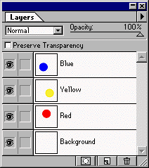
You can always see the current structure of your image by looking at the 'Layers Panel' in the Photoshop window. It shows you how many layers you have, what they contain (in miniature), and their order. An screen shot of the Panel is shown just below. |
|
|
An example may help to make a little more sense of all this. Let's assume we have a simple 4-layer image . . . |
|

'Blue'
|
|

'Yellow'
|
|

'Red'
|
|

'Background'
|
|
|
Note that layers "Blue", "Yellow" and "Red" are transparent apart from the coloured disks. If the layers are ordered like this, as shown in the Layers Panel . . . |
|
 |
|
. . . then this is how
the image looks . . .
 |
|
|
Now let's see what happens when we make a couple of simple changes. |
|
First, let's move "Red" to the front of the image. Do this in the Layers Panel - just click and drag the "Red" layer to its new position at the top of the stack of layers. The effect on the image is that the lower part of the red disk now obscures the upper parts of the blue and yellow disks, rather than the other way round. |
|
 |
|
Second, let's reduce the opacity of "Red" to 60%, i.e. 40% transparent. You do this also in the Layers Panel. Click on the "Red" layer to give it focus, then click and drag the 'Opacity' slider (at the top of the Panel) until it reads "60%". The effect on the image is that the other layers are now partially visible through the red disk - the red is faded by the white backgound, blended to violet where it overlaps the blue disk, and blended to orange where it overlaps the yellow disk. |
|
 |
|
Third (OK, we know we said "a couple", but who's counting?), let's reduce the opacity of "Blue" to 60% as well. The effect on the image is basically a progression of the previous change. We could go on - and on, and on - but no (did we hear someone say "thank goodness"?); you've got the idea by now. |
|
 |
|
|
And that's really all you need to know about Layers - for now. |
|
|
|
Time to move on, with a reminder of our "50% Nearest Neighbor" tile and the background it makes . . . |
|
|
|
|
Now let's "play around" . . . |
|
METHOD 1 - OPACITY |
|
Just reduce the tile's opacity. |
|
75% opacity
 |
|
|
|
50% opacity
 |
|
|
|
35% opacity
 |
|
|
|
|
Well, the 75% isn't too bad, but the other two aren't so much subtle as washed out - although they do offer quite suitable backgrounds for dark text. |
|
We should mention that the image we worked with here consisted of just one layer, so there's no background to show through when we reduce its opacity. You could say it has a transparent background; this is where the washed-out look originates. Remember that we export the image from PhotoShop as a GIF (i.e. the tile), which is what you see above. Well, the export process uses a "Transparency Index Colour", which acts as a replacement for any element of transparency. The Index Colour can be anything - your choice; change it in the 'GIF89a Export Options' dialogue box if you wish. In this case we opted to stay with the default, a neutral light grey (RGB 192:192:192), which tends to muddy things up a bit in situations like this. |
|
METHOD 2 - OPACITY & TRANSPARENCY INDEX COLOR |
|
Let's take Method 1 a step further - changing the Transparency Index Colour when exporting the image as a GIF. But what Index Colour should we choose? White would of course have a considerable lightening/fading effect, and black a darkening effect. In situations like this we have found that selecting colours from the graphic itself - we think of them as "self colours" - tend to retain the "feel" of the original graphic, and can produce some useful results. Using a totally unrelated colour will result in a very different colour scheme to the original graphic (perhaps just what you're looking for, but more of that later). |
|
Here are some examples, all applying 50% opacity, but with various Index Colours. We've used white and black, plus three different colours lifted from the graphic . . . |
|
Index Colour |
 |
|
white |
gives |
 |
|
|
|
|
Index Colour |
 |
|
black |
gives |
 |
|
|
|
|
Index Colour |
 |
|
RGB 212:76:77 |
gives |
 |
|
|
|
|
Index Colour |
 |
|
RGB 254:80:58 |
gives |
 |
|
|
|
|
Index Colour |
 |
|
RGB 252:126:85 |
gives |
 |
|
|
|
|
|
At least one winner and some possibilities! The white is very close to the 35% opacity version using the default Index Colour, but cleaner and without that grey/blue tinge; not too bad. The black; oh yesss! We think this is a real beauty, bringing so much depth and richness to the design, with a sort of brooding subtlety. This would work extremely well as a background for large areas - even a full window - and act as a splendid foil for white or pale-coloured text. The three "self colours" are OK, more or less - still a touch bright, and still missing that subtle look - with the middle one the least good. Perhaps deeper/darker shades would work better; want to try it? |
|
Oh, we nearly forgot to mention how you change the Transparency Index Colour. Here goes . . . |
1. |
In the 'GIF89 Export Options' dialogue box, click on the square containing the Transparency Index Colour (sorry, "Color"; still can't get used to these strange American spellings, despite some American schooling in the distant past! ). |
|
2. |
PhotoShop's 'Color Picker' dialogue box will pop up. There are three ways of selecting the colour you want . . . |
|
|
|
Enter the colour's RGB codes, each 0 to 255, in the relevant boxes (lower right quarter of the dialogue box). |
|
|
Choose the shade by clicking and dragging the slider of the "vertical rainbow" (in the middle of the dialogue box) up or down until the large square "shade card" (left-hand half of the dialogue box) shows roughly what you want. You can then nudge the slider a little until it show the precise shade. |
|
|
Choose the specific colour - depth and intensity - by clicking on the appropriate spot in the "shade card"; the cursor changes to a small circle when over this area. |
|
|
3. |
Click the 'Color Picker' dialogue box's 'OK' button. That dialogue box will close and your selected colour will be shown as the Transparency Index Colour in the 'GIF89 Export Options' dialogue box. |
|
4. |
Check that the colour is what you want. If it's not, go back to Step 1 and set hte correct colour. Otherwise, click the 'GIF89 Export Options' dialogue box's 'OK' button and save your new GIF. |
|
|
METHOD 3 - OPACITY & BACKGROUND COLOUR |
|
This is really no more than a variation on Method 2 above. It gives 100% identical results so there's no point in showing any examples. Here you add a second layer to the original image, which you flood-fill with your desired colour, use at 100% opacity, and position below the semi-transparent graphic layer. This allows the solid colour to blend with the graphic. Leave the Transparency Index Colour unchanged when you export your GIF - if fact, completely ignore it as it is irrelevant. |
|
There are three ways to add a new layer to your image . . . |
|
|
Select the 'Layer' menu's 'New' option, then click on the 'Layer' function. The 'New Layer' pop-up dialogue box will appear, allowing you to pre-set certain parameters for the new layer; you don't have to do so yet if you don't want to. Whether you do or not, just click the pop-up's 'OK' button when you're finished and the new layer will be added. |
|
|
Click on the  button in the Layers Panel's top right-hand corner, then on 'New Layer' in the drop-down options list. The 'New Layer' pop-up dialogue box will appear, as for the first method. button in the Layers Panel's top right-hand corner, then on 'New Layer' in the drop-down options list. The 'New Layer' pop-up dialogue box will appear, as for the first method. |
|
|
Click on the  icon ('Add New Layer') at the foot of the Layers Panel and the new layer is added immediately. This is the simplest approach, which we prefer other the other two. icon ('Add New Layer') at the foot of the Layers Panel and the new layer is added immediately. This is the simplest approach, which we prefer other the other two. |
|
|
Whichever way you do it, there are a couple of things to remember. First, if more than one image is open in your PhotoShop window, make sure the right one has focus (just click on it) before you add the layer. If you don't, you might find yourself adding a layer to the wrong image! Second, check the Layers Panel to make sure the new layer is below the graphic's layer; just click and drag it into position if it's not. |
|
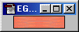
To flood-fill the new layer with your desired colour, first choose that colour. Do this by clicking on the 'Foreground Colour' patch near the bottom of the Toolbar - the orange square in the example screen-shot shown on the right - then select your chosen colour in the pop-up 'Color Picker' dialogue box. When you've set the foreground colour, select the Toolbar's 'Paint Bucket Tool' - click on it's  button - then click anywhere on your image (the cursor will now look like the button's icon). A word of warning . . . before you click on your image, make sure its new layer has focus; if it hasn't, just click on it in the Layers Panel. If you don't and the graphic layer happens to have focus, that's what you'll flood-fill - and you really don't want that, now, do you? button - then click anywhere on your image (the cursor will now look like the button's icon). A word of warning . . . before you click on your image, make sure its new layer has focus; if it hasn't, just click on it in the Layers Panel. If you don't and the graphic layer happens to have focus, that's what you'll flood-fill - and you really don't want that, now, do you? |
|
 |
|
|
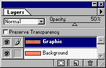
A suggestion . . . Now that you have a multi-layer image, you may find it convenient to name each layer for ease of recognition. You do this for each layer by double-clicking on it in the Layers Panel, then typing in the name. Anything simple and self-explanatory will do - "Graphic" and "Background" spring readily to mind. |
|
Just to clarify things, let's assume you decided on one of the graphic's "self colours", RGB 252:126:85, for your background colour; this is the last of the three examples in Method 2 above. The Layers Panel, the separate layers and their opacities (note the Opacity setting shown, which is for the "active" layer - i.e. "Graphic"), and the image itself will look like this . . . |
|
|
|
|
Finally, we have an admission to make. We always use this Method in preference to Method 2. It's quicker, and it has one great advantage . . . If we want to try several different background colours against a part-opaque graphic, we can set up a separate layer in the image for each of those colours. We can see straight away the result of using a particular colour, simply by moving that colour's layer immediately below the graphic layer. The "active" colour's layer, being 100% opaque, will always hide the other colours' layers so they'll have absolutely no influence on the result. If we want to keep the result, we export the image as a GIF; if we don't, we just forget about it. Sneaky, huh? |
|
|