|
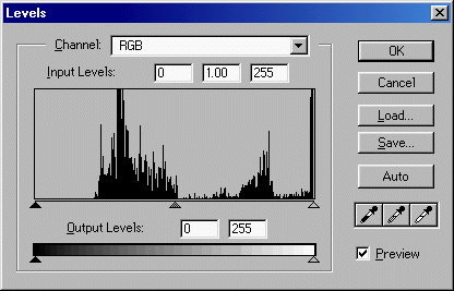
'Input Levels'. The three boxes correlate to the three slider arrows - left, middle and right - below the histogram. |
|
|
Moving the left-hand slider to the right increases the image's colour intensity; the more it's moved to the right (the corresponding box's value range is 0 to 253), the greater the increase . . . |
|
Value = 50
 |
|
|
|
Value = 150
 |
|
|
|
Value = 250
 |
|
|
|
|
|
No way! The "50" value pretty much takes us back to the original graphic before we reduced its opacity. At values beyond that, the effect is quite the opposite to what we're looking for! |
|
|
Moving the right-hand slider to the left reduces the image's colour intensity by way of lightening it; the more you move it (the corresponding box's value range is 255 to 2), the greater the reduction . . . |
|
Value = 200
 |
|
|
|
Value = 150
 |
|
|
|
Value = 100
 |
|
|
|
|
|
Some possibilities at higher values, at a pinch, but far too bleached out beyond that. |
|
|
Moving the middle slider to the right of mid-point increases the image's colour intensity, and to the left decreases it. The corresponding box's value range is 9.99 to 0.10 with 1.0 at mid-point. No additional examples are needed as the effect of movements here are the same as for a combination of the left- and right-hand sliders. |
|
|
'Output Levels'. The left and right boxes correlate to the left and right slider arrows below the bar - |
|
|
Moving the left-hand slider to the right fades the image's colours; the more you move it (the corresponding box's value range is 0 to 255), the greater the fading . . . |
|
Value = 50
 |
|
|
|
Value = 100
 |
|
|
|
Value = 150
 |
|
|
|
Value = 200
 |
|
|
|
|
|
Compare the effect here (where the colours are faded ) with that of the Input Level's right-hand slider above (where they are reduced in intensity ). An interesting difference and one that favours this adjustment, we think, up to values of about 150; beyond that, scarcely any pattern is visible. |
|
|
Moving the right-hand slider to the left darkens the image's colours; the more it's moved (the corresponding box's value range is 255 to 0), the more the colours are darkened . . . |
|
Value = 200
 |
|
|
|
Value = 150
 |
|
|
|
Value = 125
 |
|
|
|
Value = 100
 |
|
|
|
|
|
Yes, another interesting comparison to make; this time the effect here (where the colours are darkened ) with that of the Input Level's left-hand slider above (where they are increased in intensity ). The difference definitely favours this adjustment over the other - some most attractive results in the mid-range of values, very similar to using black as the Transparency Index Colour in Method 2 or as the background in Method 3 - although not worth the trouble much below 125 because you can hardly detect the pattern. |
|
|
It may seem a bit odd, but you can combine these two effects - fade-and-darken, or darken-and-fade. It's a simple matter of adjusting both sliders. |
|
|
Lets try moving the sliders toward each other . . . |
|
Left = 50
Right = 200
 |
|
|
|
Left = 100
Right = 150
 |
|
|
|
|
. . . and with the emphasis on the right . . . |
|
Left = 50
Right = 150
 |
|
|
|
Left = 50
Right = 100
 |
|
|
|
|
|
. . . and with the emphasis on the left . . . |
|
Left = 100
Right = 200
 |
|
|
|
Left = 150
Right = 200
 |
|
|
|
|
Yes!!! Now we're really getting somewhere! Some real subtlety at last, with little of the bleached or washed-out look in a reasonable number of cases. We should mention that the result is always a uniform grey if both sliders are set to the same level, lighter at higher levels and darker at lower levels - as shown on the bar itself. |
|
|
Hang on, you might ask, didn't we miss something out? Well, yes, we did. If you cross over the sliders, you get a colour transformation - to a blue palette in this case. As mentioned before, we're keeping to the graphic's original palette here; we will come back to this colour-change effect, but in our Third Exercise. |
|
|
The "eyedroppers". We really haven't got to grips with these as yet. We've played around with them a bit in a rather aimless way but, to be honest, weren't too impressed with the results on our graphic, so there was no great encouragement to dig further. We've not bothered with any examples here as most of the results were no better than the average from other functions. |
|
|
We need to take time out (from where?) to read up on this function in PhotoShop's Help pages, then use it in a logical and orderly fashion to see what it can do. When that's done we'll write up this part of the Tutorial properly, but no promises on a target date. Meanwhile, why not try it out yourself? |
|
|
The 'Auto' button. Clicking on this is the same as selecting 'Image' / 'Adjust' / 'Auto Levels', which you'll find immediately below. |
|
|
AUTO LEVELS |
|
Select 'Image' + 'Adjust' then click on 'Auto Levels'. And that's all you do. The function takes immediate effect without further intervention; there are no variables to set or choices to make. This is what it does . . . |
|
|
|
|
Wow! Gets you right between the eyes, doesn't it? This could be described as "jazzy", or "vibrant" - so long as you're not suffering from a hangover! Some misguided soul out out there might like it, but goodness knows what sort of situation would call for a background like this. Oh, and yes, this is the same colour palette as the original - but at one extreme end of its range. |
|
CURVES |
|
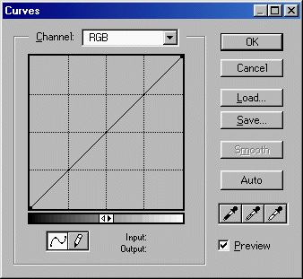
Select 'Image' + 'Adjust' then click on 'Curves ...', and the 'Curves' dialogue box pops up . . . |
|
 |
|
We're not quite sure how this function works, but it certainly has the potential to produce some interesting effects. It has two modes; we call them "curve" and "pencil", for want of better terms, which you select by clicking on the relevant mode button in the dialogue box's lower left corner. We've only ever used the "curve" function, so we'll ignore the "pencil" function in this Tutorial (makes good sense, yes?). We'll also ignore the function's eyedropper tools as we've never used them either. Finally, the "Channel" settings at the top of the dialogue box are the same as for the 'Levels' function; just scroll back up to have a look. We've stayed with the 'RGB' option here, too, as the others modify the image's colour palette. |
|
So, on the the "curve" mode. It is somewhat similar in its effect to the 'Levels' function, but here you have very much greater control. A direct quote from PhotoShop's Help pages will explain it better than we could - it's not too technical . . . |
|
"Like Levels, Curves lets you adjust the tonal range of an image. However, instead of making the adjustments using just three variables (highlights, shadows, and midtones), you can adjust any point along the 0¢255 scale while keeping up to 15 other values constant." |
|
Apologies, Adobe, if we've compromised your copyright. If we have, please let us know and we'll put things right. |
|
|
You adjust a point "along the 0-255 scale" simply by positioning the cursor on the appropriate point on the diagonal line (in the dialogue box's main grid) then clicking and dragging up or down. You can see what that does by looking at your image; just make sure you've ticked/checked the dialogue box's 'Preview' option. To us it's very much a case of "trial and error" as to what point to use to get a particular effect - and remember that you can use up to 15 points! This mode could be something of a paradise for anyone who likes "playing around"; the possibilities are considerable, within limits. The best we can do here is to give you an idea by showing a few random examples . . . |
|
|
|
|
|
|
|
|
|
|
|
|
|
|
|
|
|
|
|
Gosh! Some real surprises - though not really the subtle look we're seeking - and pushing the colour palette boundries more than somewhat! These are interesting results and illustrate well the potential scope of this function. You might just find what you're looking for, with another graphic, so it could be worth your while investigating further. |
|
BRIGHTNESS/CONTRAST |
|
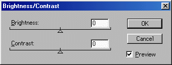
Select 'Image' + 'Adjust', click on 'Brightness /Contrast ...', and the function's dialogue box pops up . . . |
|
 |
|
Here's a good example of WYSIWYG - the two facilities names speak for themselves. In each case you just click and drag the slider to chenge the level of 0 at mid-point to between -100 (drag left) and +100 (drag right). Logically, these facilities should - either singly or in combination - give us the subtleness we're looking for. Let's see if they do. |
|
First, adjust 'Brightness' only . . . |
|
Level = -100
 |
|
|
|
Level = -50
 |
|
|
|
Level = +50
 |
|
|
|
Level = +100
 |
|
|
|
|
Second, adjust 'Contrast' only (note that a level of -100 gives you a white image) . . . |
|
Level = -66
 |
|
|
|
Level = -33
 |
|
|
|
Level = +33
 |
|
|
|
Level = +66
 |
|
|
|
Level = +100
 |
|
|
|
|
|
Oh, well, nothing new here; it was worth a try. These results do little more than repeat those from the 'Levels' function above - reasonable at moderate adjustments. But what if we made a combined adjustment, of both 'Brightness' and 'Contrast'? Here are some judiciously chosen examples aimed specifically at that elusive subtleness . . . |
|
Brightness = -33
Contrast = -33
 |
|
|
|
Brightness = -50
Contrast = -33
 |
|
|
|
Brightness = -50
Contrast = -66
 |
|
|
|
Brightness = +20
Contrast = -40
 |
|
|
|
|
Hmmm. The first two look pretty good, very close to what we've been trying for - particularly #2 (we'll keep that one on the back burner) - but something is still not quite right. Onwards and upwards! |
|
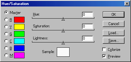
HUE / SATURATION |
|
Select 'Image' + 'Adjust' then click on 'Hue /Saturation ...', and the function's dialogue box pops up . . . |
|
 |
|
Another WYSIWYG function! Don't forget that we're leaving the 'Hue' facility until we deal with colour changes in Exercise Three. |
|
As to 'Saturation' and 'Lightness', you use them in exactly the same way as the 'Brightness/Contrast' function above - click and drag the sliders to give values between -100 and +100. A couple of points before going on . . . First, we've kept the 'Master' option in the dialogue box's top left corner. The others impact on colour so we're ignoring them for now. Second, if you tick/check the 'Colorize' option in the dialogue box's lower right coner, all you get is an image in shades of bright red. We don't know why, but it does absolutely nothing for us. |
|
Let's have a look at what 'Saturation' can do for us - its sounds promising . . . |
|
Level = -100
 |
|
|
|
Level = -66
 |
|
|
|
Level = -33
 |
|
|
|
Level = +33
 |
|
|
|
Level = +66
 |
|
|
|
Level = +100
 |
|
|
|
|
. . . and now 'Lightness' (note that a level of -100 gives you a black image, and +100 a white image) . . . |
|
Level = -66
 |
|
|
|
Level = -33
 |
|
|
|
Level = +33
 |
|
|
|
Level = +66
 |
|
|
|
|
More repeats of previous results using other functions. It's fair to say that moderate reductions in Saturation - and small changes in Lightness - offer something of use, but not what we're looking for. Useful facilities for all that. |
|
Combine the two facities? Yeah, why not; here are a couple of examples . . . |
|
Saturation = -50
Lightness = -50
 |
|
|
|
Saturation = -30
Lightness = -30
 |
|
|
|
Saturation = -50
Lightness = +20
 |
|
|
|
|
Possible, just possible; #2 isn't too bad. |
|
EQUALIZE |
|
Select 'Image' + 'Adjust' then click on 'Equalize'. Just like 'Auto Levels', there's nothing more to do. We're none too sure what "equalising" is, but this is the result . . . |
|
|
|
|
Definitely not subtle, in fact a lot less subtle than the original! But it has great appeal and you can almost taste it - juicy, sweet, fruity . . . Yummy! |
|
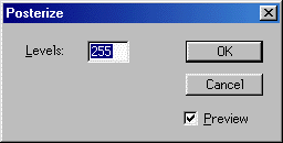
POSTERIZE |
|
Select 'Image' + 'Adjust' then click on 'Posterize ...', and the function's dialogue box pops up . . . |
|
 |
|
This function "lets you specify the number of tonal levels (or brightness values) for an image and then maps pixels to the level that is the closest match" (quote from PhotoShop's Help pages - we couldn't put it better ourselves! ). All you do to use it is to enter the number of levels in the box, between 2 and 255, then click 'OK'. We found that any setting higher about 20 had no discernable impact on our image. Below about 10 the effect was to increasingly coarsen it; not a pretty sight . . . |
|
Level = 20
 |
|
|
|
Level = 15
 |
|
|
|
Level = 10
 |
|
|
|
Level = 5
 |
|
|
|
Level = 3
 |
|
|
|
|
As you can see, this function does absolutely nothing to advance our quest for subtlety! |
 |
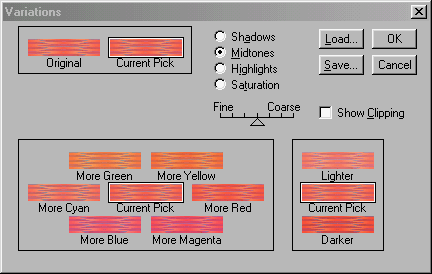
VARIATIONS |
|
The very name sounds promising! Select 'Image' + 'Adjust' then click on 'Variations ...', and the function's dialogue box pops up . . . |
|
 |
|
"Oooo! There's a lot here, isn't there?" Dont panic, Mr Mannering; be calm, think lovely thoughts. This function is essentially a re-mix of some of the other 'Adjust' functions - color balance, contrast, and saturation - all under the one roof, so we'll avoid repetition and omit examples of results. The great advantage advantage of the way they are packaged here - for "suck-it-and-see" merchants like us - is that you do it visually ; there are "before and after" versions of the image in the dialogue box. Not only that, you adjust the image simply by clicking, and can vary the degree of adjustment each click will make. |
|
So how do you use this box of wonders? Let's go though it logically . . . |
|
|
'Shadows', 'Midtones', 'Highlights' and 'Saturation' (top centre) are this function's primary options, so your first step is to choose one of them. Your choice determines what is displayed in the "Big Box" (bottom left) and "Little Box" (bottom right), which offer you the function's secondary options. |
|
|
The "Big Box" . . . |
|
|
If you select 'Shadows', 'Midtones' or 'Highlights', you're offered the option to adjust the named element's colour in various ways, as shown in the screen shot above. We're leaving the whole subject of colour changes to our Third Exercise, remember, so we'll ignore this for now (be patient! ). |
|
|
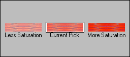
If you select 'Saturation', you're offered the option to adjust . . . well done, you've got it in one . . . the image's colour saturation, like this . . . |
|
 |
|
|
The "Little Box" . . . |
|
|
If you select 'Shadows', 'Midtones' or 'Highlights', you're offered the option to adjust the named element's contrast - lightness/darkness - as shown in the screen shot above. |
|
|
If you select 'Saturation', nothing is shown; the Box will be blank. |
|
|
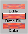
The dialogue box includes several versions of your image - in the "Original/ Current Pick" box (top left), and in the "Big Box" and "Little Box". Each version is labelled which its effect, showing how your image will look if you click once on that version. There are two exceptions: first, 'Original' shows your image as it was when you selected this function, i.e. before any adjustments (what a novel bit of labelling! ); second, all 'Current Pick' versions are the same, and show the cumulative effect of any and all adjustments you have made since selecting this function. |
|
|
The 'Fine'/'Coarse' slider (middle centre) allows you to change the amount of adjustment to be made when you click on one of the image's versions - 'Fine' is less adjustment, 'Coarse' is more. |
|
|
The 'Show Clipping' option (middle right) allows you to "see a neon preview of the areas in the image that will be clipped - that is, converted to pure white or pure black when the adjustment is applied" (quote from PhotoShop's Help). Frankly, we fail to see what use this could possibly be in the normal course of events, so we always leave it unticked/unchecked. |
|
|
Now that we've prepared the ground, we can move on to actually making adjustments to our image. All you do is go to the "Big Box" or "Little Box" and click on the image version labelled with the action you want to take. That image - and all the other image versions - will change to show the effect of your adjustment. You can click on it again if the change isn't enough, more or less as many times as you want. If the degree of change with each click is too much or too little, move the 'Fine'/'Coarse' slider accordingly, then try again. Finally, if and when you've got the effect you want, just click 'OK' and the overall adjustment is applied to your image. |
|
Easy though the procedure is, it'll be clearer if we take a specific example. Let's assume we want to darken our image's midtones. This is what happens with the 'Fine'/'Coarse' slider set to mid-point. . . |
|
Start
 |
1 click
 |
2 clicks
 |
3 clicks
 |
|
|
. . . and so on. This illustrates perfectly the advantage of this function which we mentioned earlier - you can always see the effect of your adjustments as you go along. Isn't it great? Oh, and one final point: you can use any number of the different adjustment options and facilities during a single "visit" to this function. |
|
|
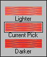
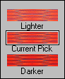
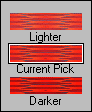
'Original' and 'Current Pick' (top left) are just what you might expect from the names - the former shows what you started with and the latter what you'll get if you click 'OK'. You can cancel your changes at any time and "reset" everything back to the start point; just click on the 'Original' image. |
|
|
POST-SCRIPT |
|
The various methods described here for "playing around" with a graphic are not mutually exclusive. You can, if you wish, use them in any combination you care to concoct, all on the one graphic. The bottom line is that, if the result works, who cares how it was produced? If you think a particular approach might work, just give it a go! |
|
And after all that, did we find our elusive subtlety? Well, no, not really, although the odd one or two results did come fairly close. If we'd tried a few combinations, who knows? Perhaps our next Exercise will prove more fruitful . . . |
|
A last thought . . . All but the "rubbish" results from this and the next Exercise are available as Tiles in this Gallery; some are very similar to each other. Have a look and decide whether you like any enough to download and use . . . |
|
|
|
|